10 Interior Fails That Could Make You Mad
Interior of the cars is what attracts most of the car lovers. Therefore, in this regard, many car companies strive to introduce or modify the car’s interior by introducing every now and then, with some advancement.
However, such experiments usually ruin the car’s interior. Thus, making it not only looks ugly but also infuriating people due to the inconvenience that this interior fails causes.
>> Best deals for you: Toyota Prius 2011 for sale, Subaru Forester 2008 for sale
Examples of Interior Fails Wrecking the Car’s Cabin
Packed with luxurious material, there are certain examples of interior failure in cars that are actually boiling people’s blood.
1. Rubbish Cup Holders
No doubt for people’s ease, the car companies like BMW or Chevrolet has designed the space for holding the cups of your alcohol or other drinks. These can be found either near the gearbox or near the car’s dashboard.
However, the size of these cup holders is quite smaller than the size of the glass or disposable cups. Due to this, these holders have just become a useless space in the car. Moreover, during the gear change, the small cups placed in them would cause the liquid to spill all around the area. Thus, it makes the car area look soiled and unclean.
Surprisingly, some luxurious cars don’t have these holders only.
2. No Grab Handles
In fact, some of the cars, which needs roof handles, don’t have in them. Ford Eco Sport is one such model, which doesn’t have these handles in the car. In order to give the car a lavish look, the designers have failed in this regard.
Therefore, while driving when the poor passengers would try to hold the handles, surprisingly, they won’t find one.
Here we come with the video!
3. Seat Recline Handles
If the car doesn’t have the electric seats, there would be a dial to adjust its positioning comfortably.
But most of the cars have the lever at the side, which doesn’t let the car seat adjust properly unless you sit on it. Or else, if you try it then, the seat would bend too much causing-pain in your neck (if didn’t change). Hence, this one feature really needs the replacement in all the vehicles.
4. The Pit of Doom
Well, this is something really a troublemaker. With a lean gap on the sides of the seat, it allows all the items like comb, keys, phone and many other to go below the car’s seat. So, if you are driving or are in a rush to go somewhere, such things annoy a lot.
Therefore, this interior fails needs immediate attention from the car’s companies.
SEE MORE:
5. Auto Gearboxes Masquerading as Manuals
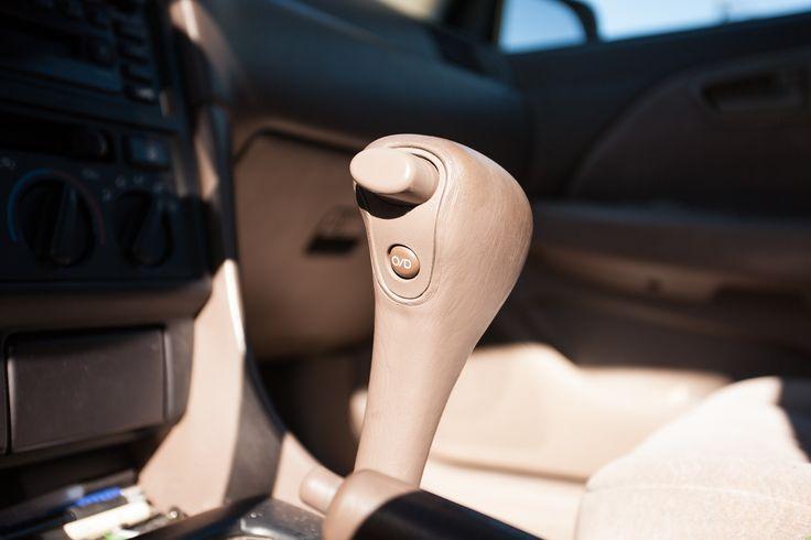
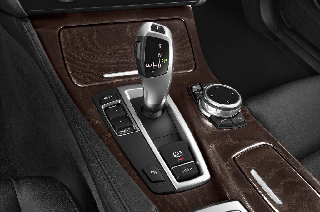
Most of the companies have the habit of making their automatic gearbox look like more of a manual shifter. They have the gear shifter and the round knob on its platform. However, there is no point of making it look like as a manual because it is nothing but a way to fool the users.
6. Ugly Stuck on Screens
Topping this list are the cars of the BMW. With the accumulation of all the multimedia features in one screen, its external design is something, which actually needs modification. This is so because instead of embedding the screen it is actually attached to the dashboard of the car, which makes it look more like a stuck tablet or a phone.
7. Fake Carbon Fiber Trim
This design is usually seen on the steering wheel or, above the cabin area of the car. It is mainly introduced with the notion that it affects the performance of car interior. There is no doubt that it gives a nice look to the car but otherwise, it is just a fake bit of carbon fiber trim, fooling people.
8. Piano Black Plastic
With most of the car companies making use of piano black plastic in the car, doesn’t look good to many eyes. As this material is quite shiny, therefore even a small scratch on it would be visible to the naked eyes. Moreover, these ridiculous scratches don’t go away even if cleaned with some liquefied chemical.
Hence, there is a great need of such sort of material, which doesn’t the car’s interior look nasty or cheap.
9. Hand-Brake Underneath The Armrest
There is no idea what made the company’s think of designing it. This is actually a huge blunder in car designing, as the driver has to close the armrest in order to pull the handbrake. Therefore, this isn’t the ideal design of the armrest for the driver’s seat.
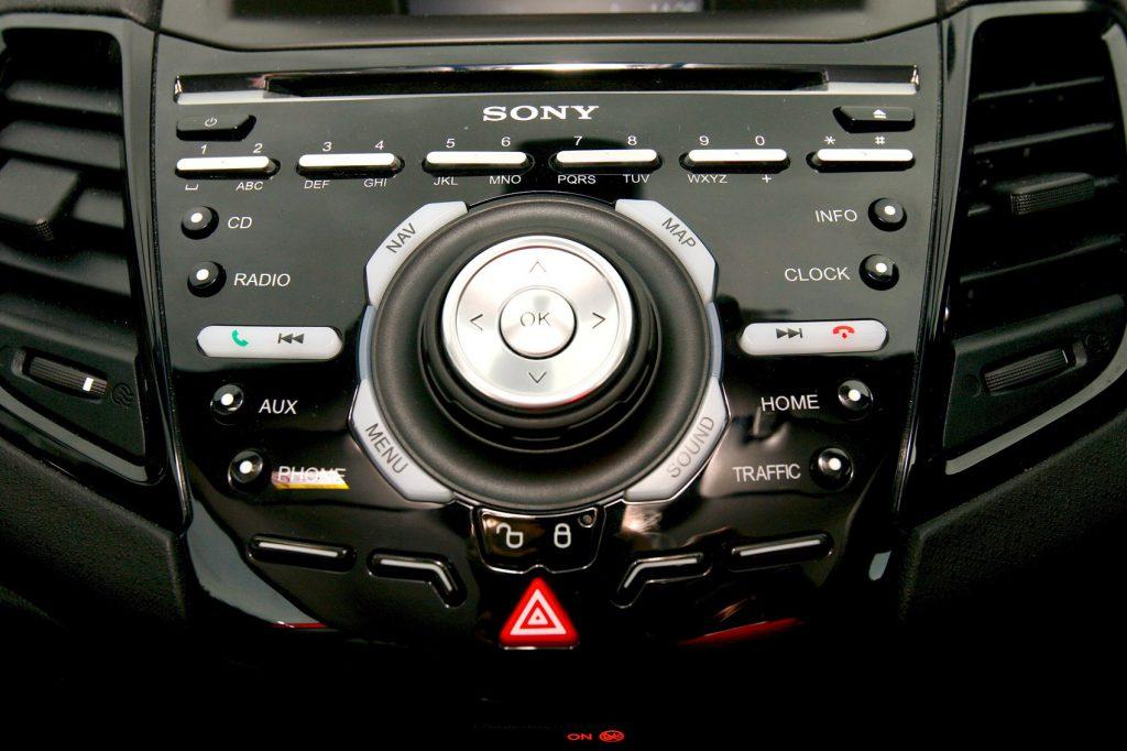
10. Too many Buttons
With too many buttons on the dash, it actually makes the car’s design look nasty. With old Ford Focus ST in this list, its button-laden console in the center of the car was actually the bad design in the car.
So, the car manufacturer’s there is a request to you all. Please sort all these maintenance and design interior fails and make your customer’s happy.


