An automaker’s logo is what sets it apart from the rest and makes the buyers recognize the brand. The same goes with Kia that is the part of Hyundai. Kia has introduced the logo emblem for the recognition. When we talk about the Kia logo, there are two variations that it uses to represent the vehicles in different regions.
Let’s discuss further the brand and the logo variations that represent the automobile manufacturer.
Contents
Get To Know The Variations Of Kia Logo
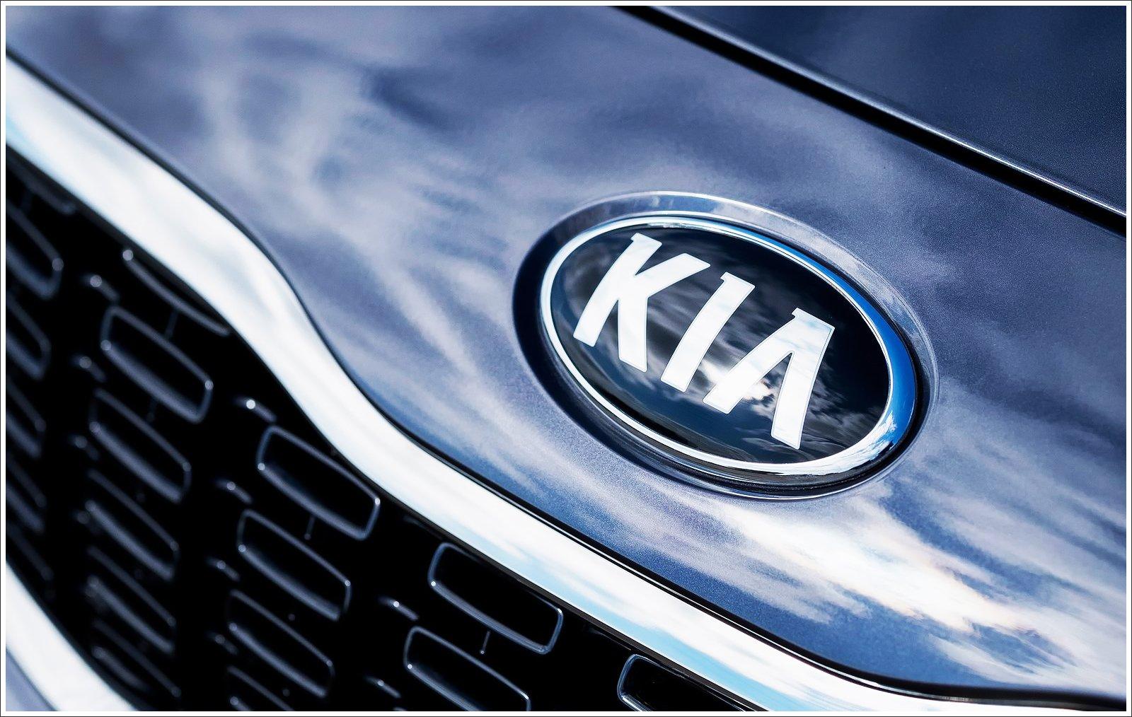
Kia logo is simple, yet it conveys the message. It is neither very much creative nor straightforward. The brand features two logos: one is text-based, and another is a bit more creative.
The text-based logo shows the brand name in silver with an oval shape that is also in silver along with the black background. Another logo is just an alphabet ‘K’ with the missing upright shape of K. The rest stays the same, and the logo is in the silver shade with an oval shape and a black background.
Kia keeps it simple because there is no exceptional creativity in either of the logos. As a result, to some people, it is perfect because of the simplicity.

SEE MORE:
- Know the Facts behind the Mercedes Benz Logo
- Dig Deeper About Different Car Brands and Enlighten Yourself
Introducing The Novel Kia Logo
Kia launched two different logos for the same brand for a reason. The text-based logo clearly says KIA except the horizontal line is missing in ‘A.’ This logo was designed for the international market or every vehicle of Kia that gets launched in all over the world except South Korea.
Another variation is the Kia Korean logo in which it brings only the alphabet ‘K’ comes embossed in the vehicles of South Korea alone. The models built in Korea come with the distinctive logo of Kia that is the stylized K.
However, it hardly comes in any models outside Asia. The K design used in the logo is not any simple one, and if you notice closely, it comes with the sharp curves of the alphabet. It seems pointy and kinetic that depicts energy and speed and so the logo feels right for the manufacturer.
As per the recent reports, Tom Kearns, the chief designer for the Kia brand has said to redo the Kia badge. 2019 may be the dawn for Kia in terms of the emblem that represents the brand. Like other automobile manufacturers BMW and Mercedes, Kia may also return with the innovation. The removal of the oval shape, change in the font style, and added up creativity may bless Kia with a logo that no one has imagined yet.

As no brands can afford to throw their past logo’s design and start with all new, Kia may initiate with a bit of tweak. It may be in a way that resembles the old design as well as the new one. We can expect it to be something cool for Kia. Making major changes in the logo can be harmful to Kia’s reputation, and thus they may start with changes while taking care of the industry’s standards.
Interesting Facts About Kia
Every automobile manufacturer has some facts that are known to very few people. The same applies to Kia as there are several things that you would find interesting. Let’s discuss-
Kia symbol does have the meaning as per the founder Chul-Ho Kim. Ki depicts ‘ki’ that means arise, and A signifies Asia. It can be ‘rising out of Asia.’
Kia is one of the old automobile manufacturing companies; it has been serving since 1944. It was first known as KyungSung Precision Industry that later changed to KIA in 1951.
KIA Pride was the subcompact introduced in 1986 that brought KIA into the limelight for its reliability and price-friendliness. Enlighten yourself with more knowledge on vehicles and their brands by visiting Industry Knowledge.
In 1998, KIA became the victim due to the financial crisis as a decline in sales. So, it was acquired by another automobile manufacturing company – Hyundai.
Today, KIA serves in more than 190 countries with more than 5000 dealerships.
In Ulsan, South Korea, KIA owns the world’s largest assembly factory.
There are various KIA models that got the name from different geographical locations. Such as Cerato that means peak and Mohave that is a desert.
Peter Schreyer – the German designer became a part of KIA in 2006 who used to design for Audi and Volkswagen. He came in light for all the unique features in KIA models, and he serves well as one of the three directors of Kia or the entire Hyundai Motor Group.

Conclusion
Because of the variations in designs, the Kia logo always stays in gossip. The automobile company is well-known for producing budget-friendly vehicles, and so, perfect for families. The brand may deliver a fresh design resembling the old one as per the reports and new automobiles too with the latest techs. Let’s hope for the best, we hope you enjoyed reading the facts.


