A logo represents the brand identity of a company—it is more than just a sign or letter. Like other automaker brands, the Mazda logo also has a fascinating history that tells a tale of the company’s transformation over the course of around 100 years.
Contents
What Does Mazda Mean?
Based in Hiroshima, the Japanese automaker has already become able to establish its footing in most international markets, especially in Europe.
Jujiro Matsuda founded the company under the name Toyo Cork Kogyo Co Ltd in 1920. The company was the manufacturer of machine tools but it switched to automobile production in 1931.
The first vehicle it produced was the famous Mazda-Go, a three-wheel truck. In fact, the name Mazda came from the name of this vehicle.
According to the company’s official website, the Zoroastrian God Ahura Mazda (God of Light) was the inspiration behind this name. The company hoped that such a name would brighten the image of these vehicles.
The website also records that the name of Jujiro Matsuda, the founder of the company, was another inspiration behind this name.
SEE MORE
A Brief Mazda Logo History
Studying the new and old Mazda logos will make you realize how fascinating and rich the evolution has been. The Mazda emblem has grown into one of the most recognized symbols in the automotive industry.
There are multiple interpretations of the Mazda symbol meaning. Let’s see their evolution over the years:
1934
This is the first ever Mazda logo that made its debut in 1934—the production year of the three-wheel trucks. It was just a letter representation of the company name.
1936

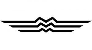
This Mazda badge was the first proper logo of the company. The inspiration came from Hiroshima, the hometown of the company. The emblem represents a stylized triple “M” in the center, highlighting the first letter of the brand’s name.
The wings on both sides indicate the speed and agility of their vehicles and the potential of gaining soaring popularity.
1959
The next logo was around for 16 years—from 1959 to 1975. focused on the letter ‘M’, the new emblem dropped the resemblance to Hiroshima and effaced the wings. It was released in the same year of Mazda passenger cars.
1975
 From 1975 to the next few decades, the company did not use any official logo. Rather, it introduced a stylized version of the brand’s name, Mazda, on all of its products and other official purposes.
The lettermark logo was released at the time when the brand took a new corporate identity. Even after all these years, the typography used in that logo is an intrinsic element of the company’s visual identity.
1991
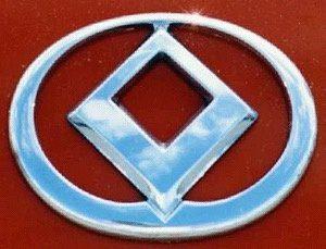
Mazda eventually released a logo in 1991 and brought back many early symbols into that emblem. This time, the Mazda symbol was a diamond-like shape featuring the imagery of the sun, wings, and a light circle.
1992
 The previous logo lasted only for a year due to its resemblance to the Renault logo, which also has a diamond shape. So, Mazda brought a new logo in 1992 where the sharp edges of the diamond were smoother. It still had the sun, light circle, and the dimension of wings. This one was the basis of the brand’s current logo.
1997
The current Mazda logo made its debut in June 1997. The logo depicts many qualities that the brand has incorporated throughout the history of its badge. It shows creativity and the potential for the company to continuously grow.
The logo has a stylized ‘M’ at its center that almost looks like a ‘V’. The ‘V’ shape represents the stretching wings incorporated in earlier badges, showing the company’s desire and mission of soaring into the future.
Mazda’s mission is to always look for a room to improve and expand.
The company developed this philosophy by introducing the ‘Zoom-Zoom’ tagline in 2000. It expresses the ethos of ‘emotion of motion’ integrated into the vehicles manufactured by the company.
Mazda brought forth a new global visual identity in 2008. The makeover did not involve changing any aspect of the brand symbol but embracing a ‘dynamic wing’ graphic and displaying the Zoom-Zoom lettering at a certain angle.
The new gradient of lettering represents the bold, innovative, and exclusive nature of the company’s goal and principles.
FAQs on Mazda Logo
-
Why did Mazda change its logo over the years?
Mazda changed its logo to stay relevant and align with its evolving brand identity and design philosophy. Each change represented a new chapter in the company’s history and its commitment to innovation.
-
Are there any hidden meanings in the Mazda logo?
While there are no official hidden meanings, some interpretations suggest that the circular shape symbolizes unity and harmony, while the stylized “M” represents Mazda’s dedication to making mobility accessible to all.
-
How has the Mazda logo contributed to the brand’s recognition?
The Mazda logo has played a significant role in brand recognition. Its unique and evolving design has helped Mazda stand out in the automotive industry, making it instantly recognizable to consumers.
-
Can I buy merchandise with the Mazda logo?
You can purchase merchandise with the Mazda logo, such as clothing, accessories, and collectibles. These items are often available through Mazda dealerships and online retailers.
-
What’s the significance of the silver color in the Mazda logo?
The silver color in the Mazda logo represents modernity, innovation, and sophistication. It adds a sense of premium quality to the brand’s image.
-
Is there a chance that Mazda will change its logo again in the future?
While it’s always possible that Mazda may update its logo in the future to reflect new design philosophies or brand strategies, any such change would likely be carefully considered to maintain the brand’s identity and recognition.
The Final Words
The new Mazda logo is an embodiment of the brand’s excellence and its attempt to bring innovative products for customers across the world.
The logo has become a part of the brand’s identity and communicates the company’s commitment to strive for brilliance.


